UX DESIGN
Home > UX > Kohl’s Yes2Your Rewards
Kohl’s Yes2You Rewards
approach

In order to evaluate Kohl’s Yes2You Rewards website, metrics must be chose to measure the effectiveness of their advertising, and the functionality of the site. In this study, I chose to focus on 2 items:
- Invitations – does Kohl’s parent website adequately advertise it’s member rewards program?
- Layout & Design – is the member rewards site laid out well, and is it easy to navigate?
research
System.
For a solution to properly work, it must fit within the current framework and navigation of the site. Also, the design must be seamless. I chose Illustrator to manipulate screenshots for a visual demonstration of the fixes/additions. I also created wireframes and a prototype of working solutions to allow the user to take a walk through the fix, and try it themselves.
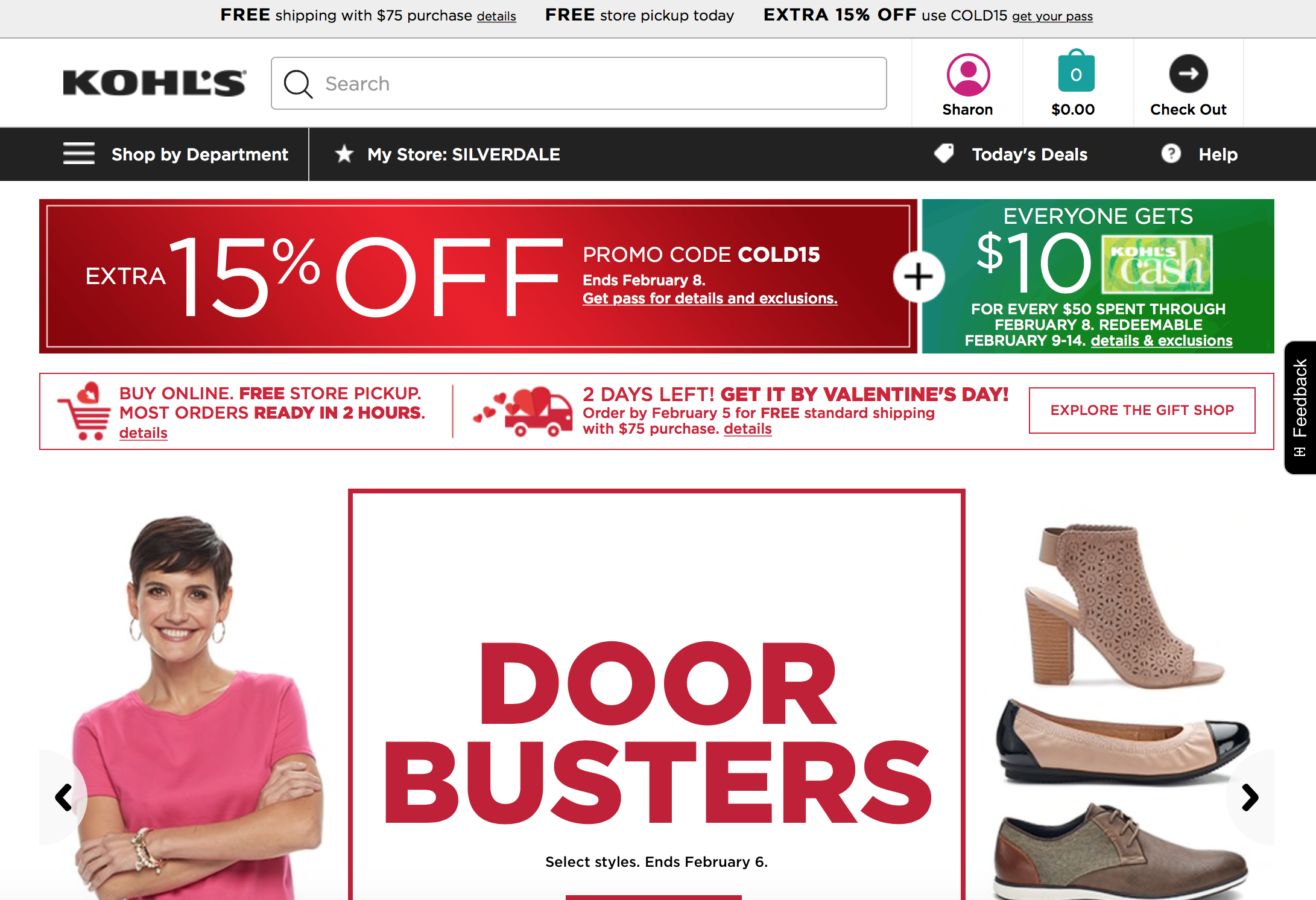
Pain Point > Invitations
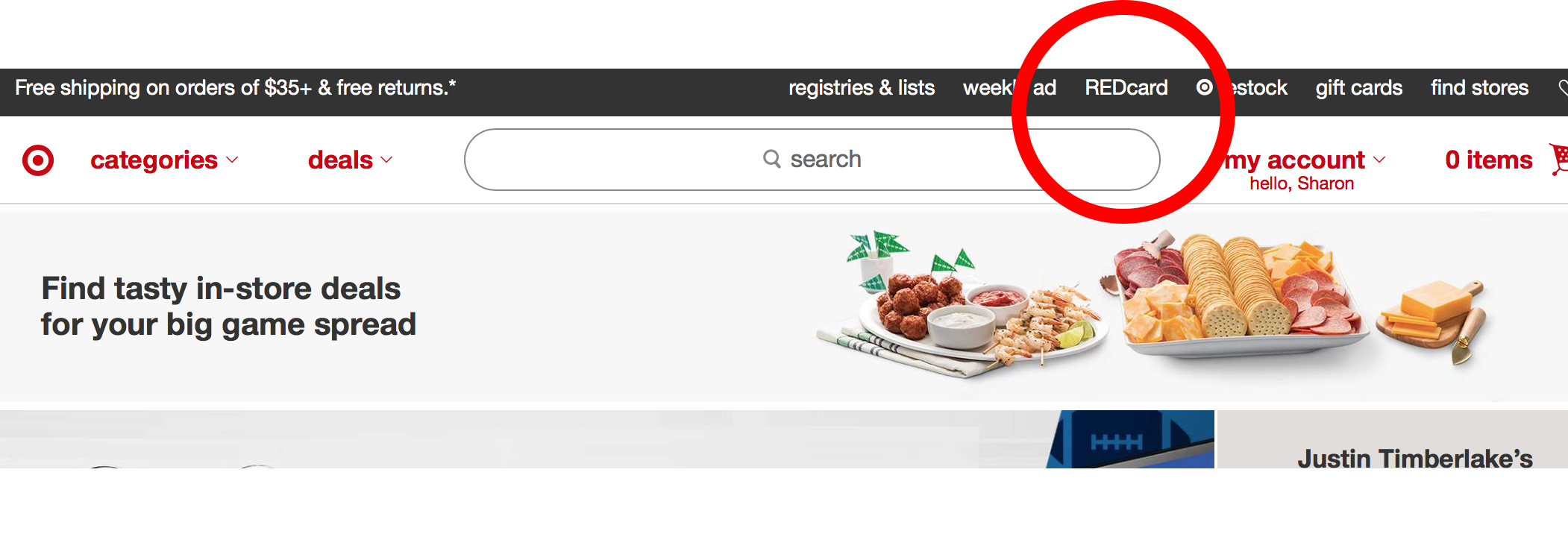
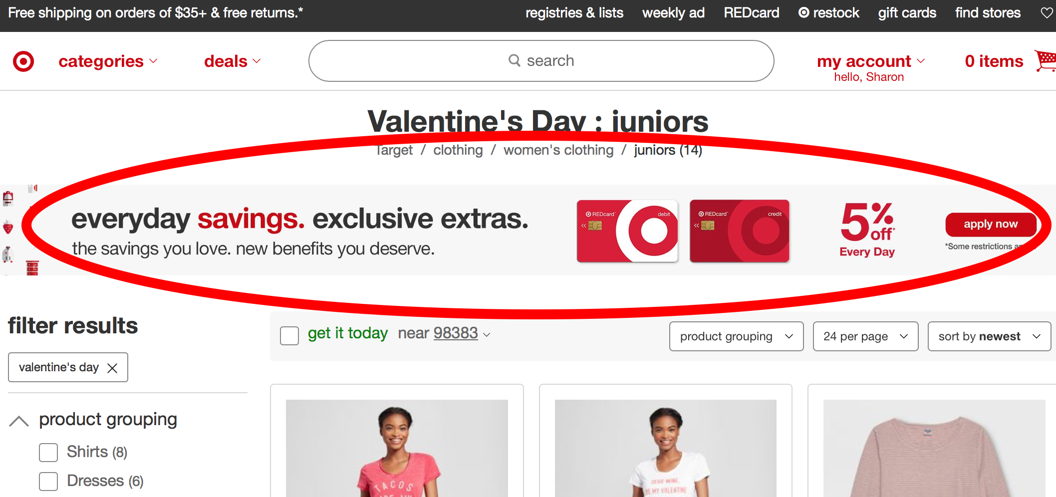
Both Kohl’s and Target have their navigation on the left via a drop-down, a banner area at the top, and sign-in areas. There is an invitation in the header for Kohl’s cash, but not the Yes2You member rewards program. Target has a clear invitation to their members rewards program, REDCard, very close to the invitation to sign in:

Kohls header invitiation
Target header invitation
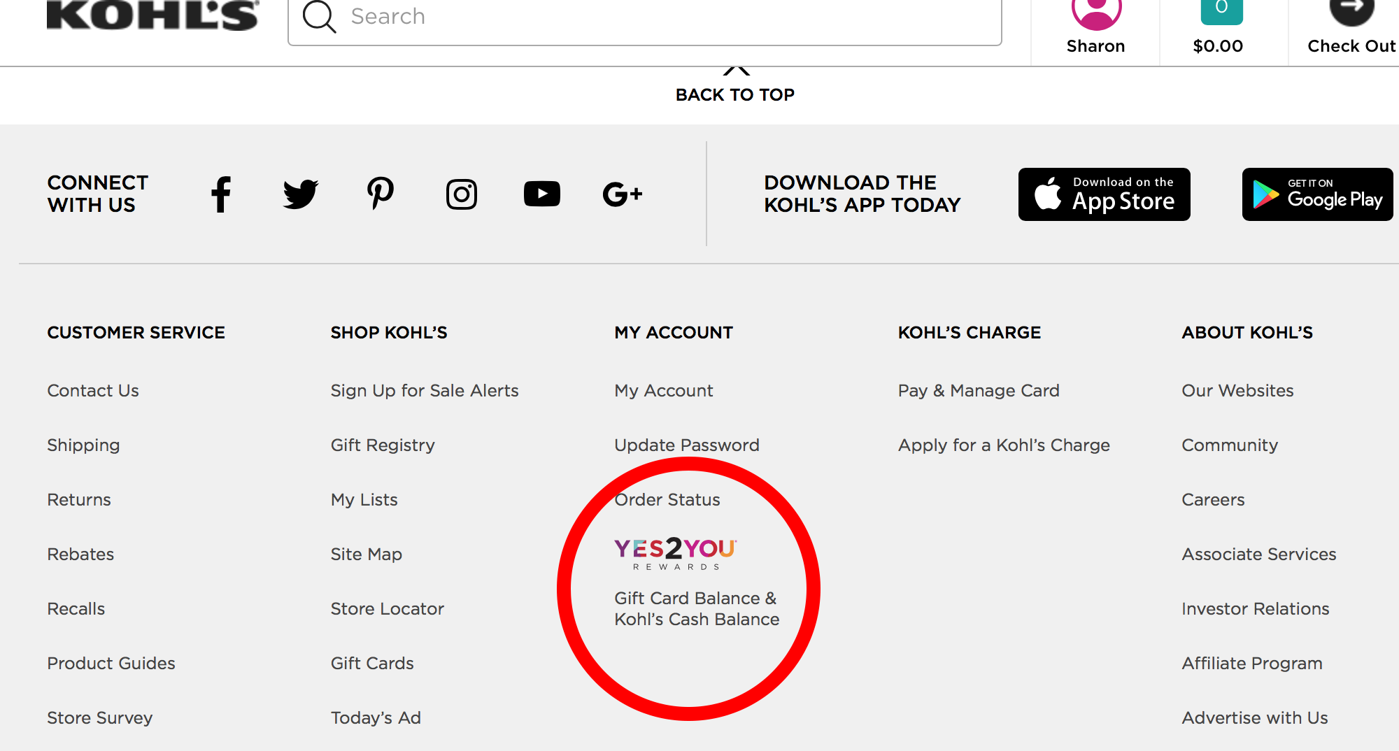
Kohl’s footer invitation

Search results of “yes2you”
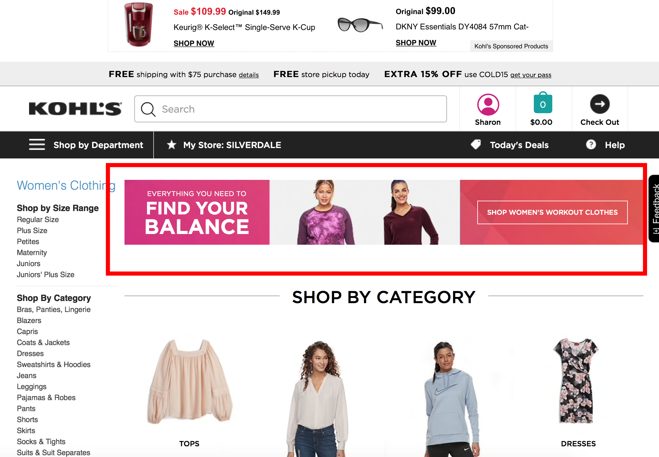
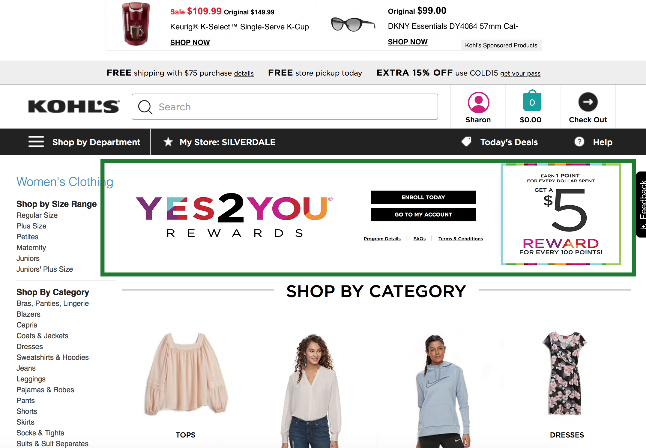
Pain Point > Layout & Design
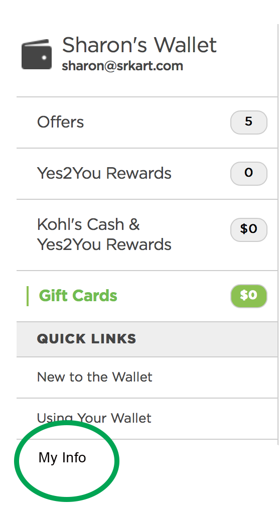
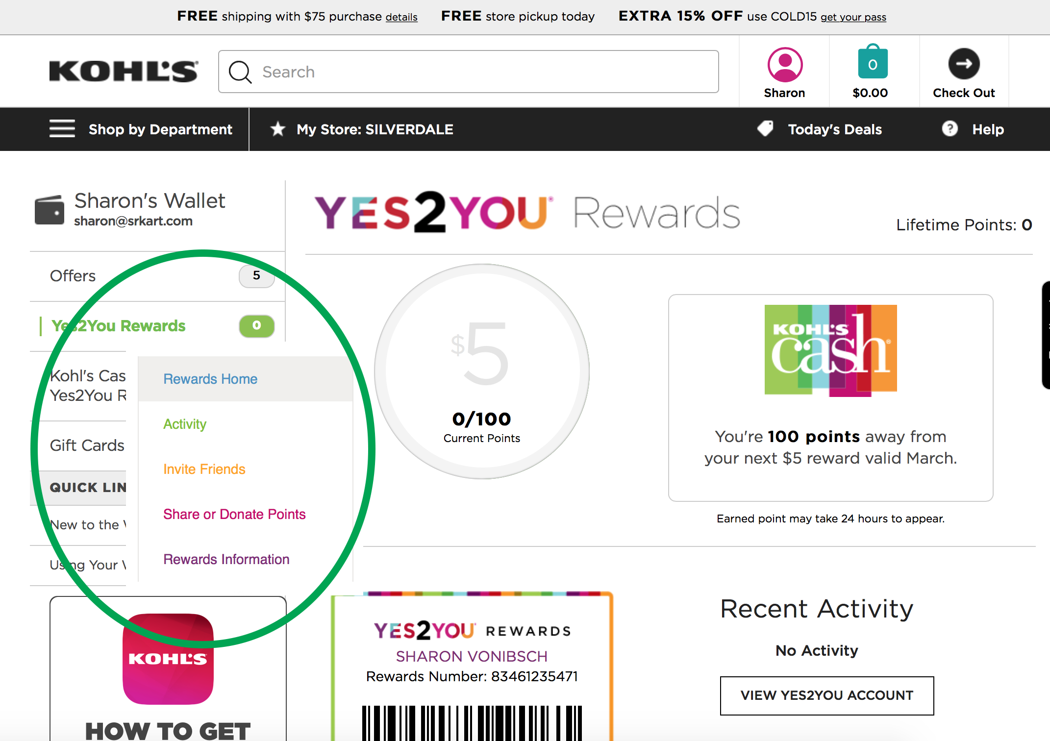
The Kohl’s Wallet is a good metaphor and usage. Customers are familiar with carrying coupons in they wallets or purses, and most still carry around their member cards to stores and services in their wallets.It is also a great organizational idea for Kohl’s and is well laid out. Navigation is on the left as expected and when a section is clicked, is stays highlighted in green and serves as a way finger for the user:
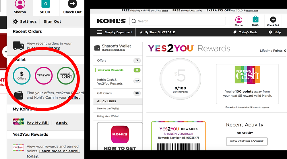
Kohl’s Yes2You wallet and navigation
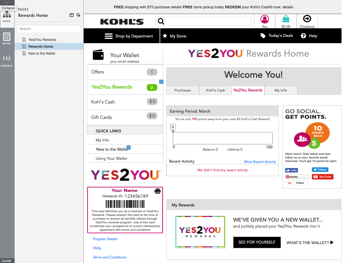
The “New to the Wallet” section is problematic. Once clicked, the customer is taken to a different view, and can only navigate back through the back button on the browser window, or by clicking on their account, and selecting an option listed under Wallet.
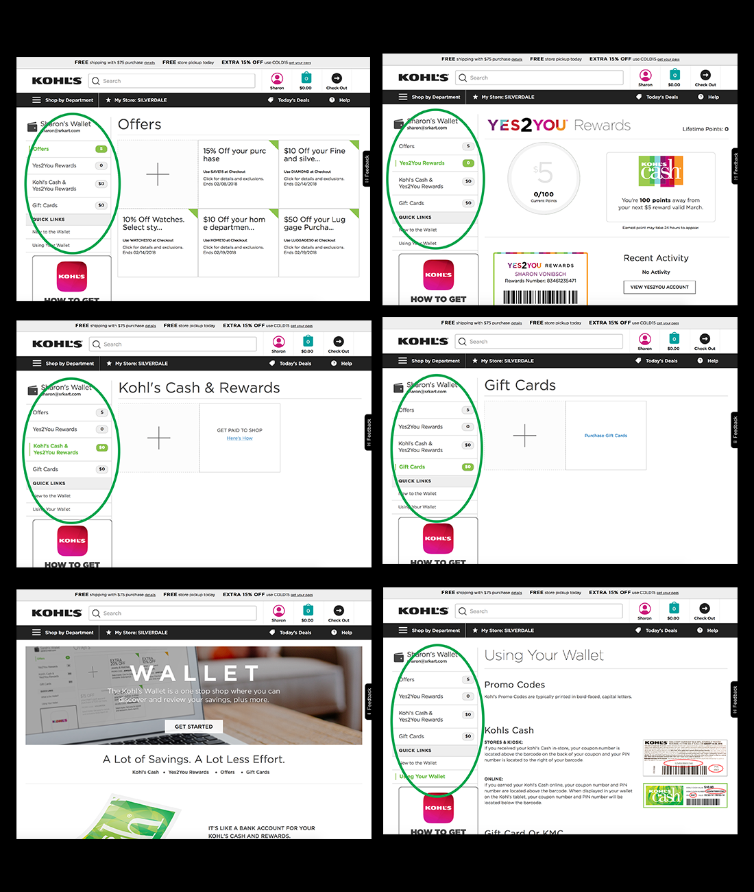
“New to the Wallet” screen does not match
Kohl’s Yes2You Account page
Default navigational menu
<< solution >>
Simply put, addressing this lack of invitations can be easily done by adding them. First and foremost, adding a visible invitation on the homepage, and within the retail portion of the site as well.
<< solution >>
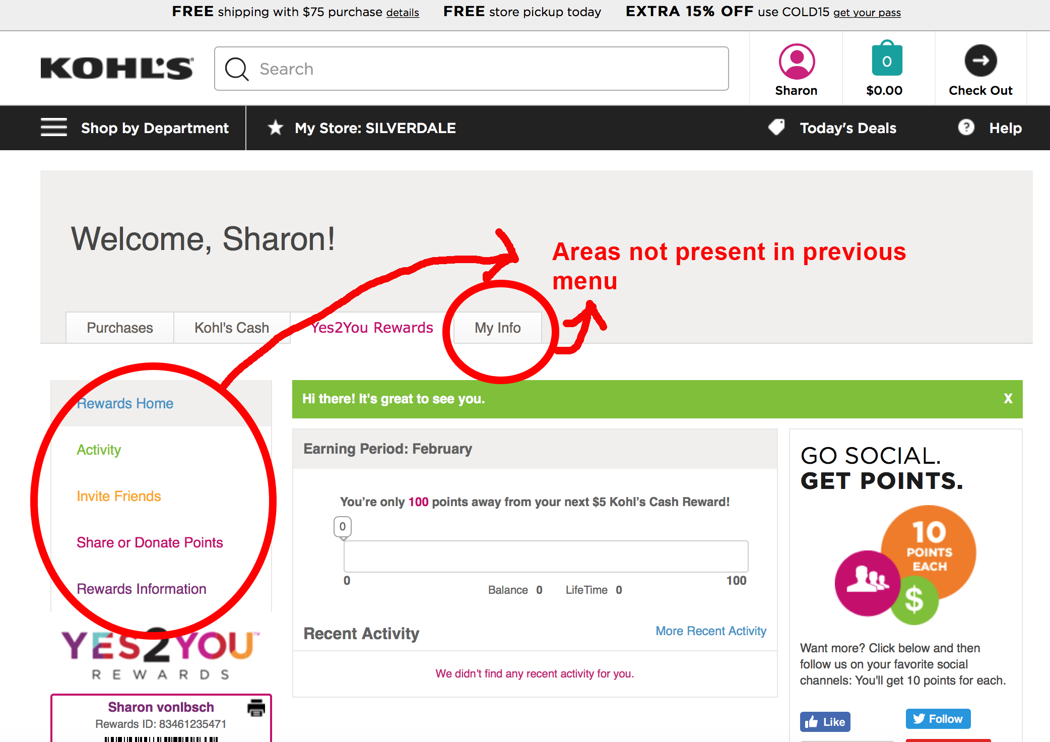
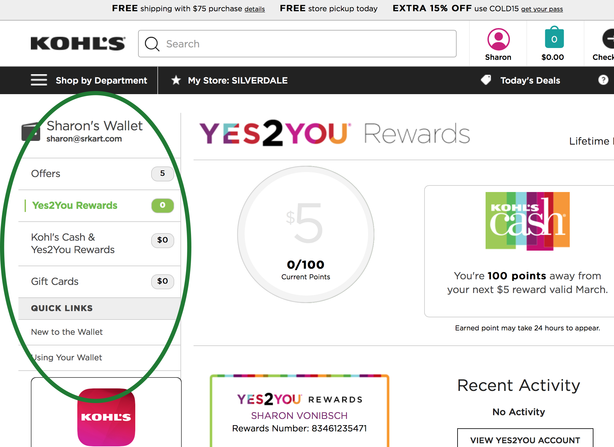
Again, fixing these problems is actually quite easy. Adding the “My Info” section to the left side navgational menu, and adding secondary navigation that pops up when Yes2You is selected.
why? >
Therefore to get the highest visibility to the Yes2You member rewards program. the invitation should be put in the upper left quadrant. Since this area is already crowded, top right is a good spot. Even if it on the smaller side, it will alert customers visually.

Gutenberg Rule
header without invitation
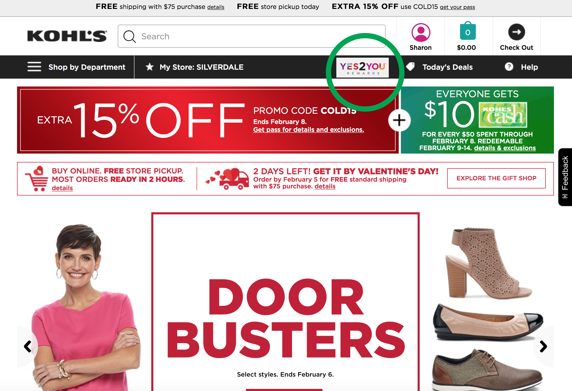
header with invitation
Banner ad example
Yes2You Banner ad
> why?
Consistent and ease of use are key in the world of web design. If a customer is frustrated or bothered by something on a website, they can easily leave.
Having navigation stay on the left side of the page adheres to the Stay on Page principle. This principle us all about keeping the user in a state of flow by “creating the experience in context, within the current page.”[1] Kohl’s accomplishes this by employing an In-Page Update to only the main body area of information. The rest of the page remains static.
In order to keep the customer in their flow, adding the “My Info” section to the navigation, and adding an overlay for the secondary navigation keeps the customer on the page and allows then to stay in the flow of their shopping experience.
[1] Designing Web Interfaces, Bill Scott & Theresa Neil, Page 126
new menu
Secondary navigation added
In the design deliverables section below are wireframes and a prototype that illustrate an interactive fix for the design and layout problems found on the Kohl’s Yes2You member rewards site.
design deliverables
wireframes
Wireframes completed to address problems and provide solutions to pain points found within the Kohl’s Yes2You Member Rewards program site.

prototype
I also created a prototype using Axure that shows changes and enhancements to three pages from the Yes2You Rewards program site.
lessons learned
This was my first prototype produced with Axure, so I had to learn it from scratch. I also learned how important consistency is within a system and design. Every time I logged into the site – during research and documentation – I was struck with how much the lack of consistent organization and layout bothered me. In future projects I know the consistency principle will stay in the forefront of my mind.